TIME LINE

Showing posts with label Dipen Gada & Associates. Show all posts

Friday, October 14, 2011

Soham Bungalow .


The owners of this bungalow, Mr. and Mrs. Parikh, are good friends of Dipen Gada and came to him with a very simple brief- to design a contemporary home for them - one that was both modern and functional. The trust the clients had in Mr. Gada, ensured that the design team had full freedom while evolving the concept. The one restriction was that no alterations could be made to the external façade since the house was part of a society. The concept that evolved was a contemporary home for a young family, which made use of clean lines and simple forms which were bound together with earthy tones that emphasized the warmth of the family.

At the entrance porch one is welcomed by a brass statue of the Buddha placed against the backdrop of a circular nuwood panel painted antique gold. The entry foyer opens out into the drawing area and family space. This space, although visually open, is demarcated through the use of colour in the furnishings. While earthy neutral tones dominate this area, the family area is identified by the bold use of magenta-pink upholstery.

One of the highlights of this area, and indeed the house, is the main staircase that leads to the first floor. Here the main RCC structure of the staircase is dressed with polished wood treads. The railing comprises of a combination of polished wood and stainless steel. The backdrop of the staircase comprises of a wall that is washed with a warm beige tone and grooved horizontally to generate visual interest. The rough wood detailing, polished wood ledge, brass Buddha’s face and fresh flower arrangement give a finishing touch to this space. A paper pulp hanging lamp that was sourced from ‘Me’ provides a vertical connectivity between the ground and first floor. ‘The volume of the staircase area dramatizes the entire space of the living room- its role as a design element supersedes its more functional primary role,” says Dipen.

The dining area, separated unobtrusively from the drawing area by a delicate partition of wood, fabric and glass, has an almost Zen-like feel to it. Here the use of highly polished ebony veneer for the dining table and chairs offsets the neutral colour palette used on the walls. Opening out into the main garden, this is a wonderful place to relax as well as to entertain, feel the Parikh’s. ‘It gives us the option of extending the living and dining area further and during the course of a party, the guests can spill out into the garden,’ beams Mrs. Parikh.

The Pooja room adjoining the dining area is designed as a tranquil, meditative space, while the kitchen is functional and easy to maintain through the use of dark laminates and granite counters.

Lighting was an integral part of the design and it has been used so that different moods can be created within the same space. This has been achieved through the use of indirect lighting to wash walls with a yellow glow.

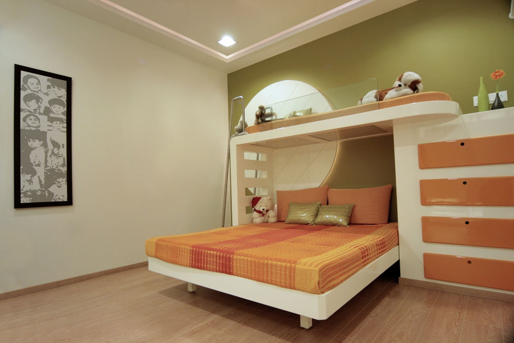
The Master bedroom and the daughter’s bedroom are located on the first floor. Dominated by a bold parrot green and orange theme, the daughter’s room is the perfect place for a young girl to play as well as entertain friends. Here strong geometric forms are accentuated by colour. The bunk bed is the centerpiece of this room. It stands out with its smooth white PU finished surfaces which starkly contrast with the green and orange theme.

The master bedroom stands out for its minimalist styling. The stark basic form of the bed with its veneered rectangular backrest is softened by the richness of the dark parquet flooring which continues into the dressing area. ‘We wanted to highlight the sloping roof in this room,’ says Dipen, ‘so we decided to keep things simple and to a bear minimum. That’s why we decided to avoid false ceiling in this room.’

The other rooms such as the parent’s bedroom, guest bedroom and study all follow a similar design language having a neutral colour palette with accents of colour in the furnishings and carefully selected artifacts.

Between the neutral colours and rich material palette, simple forms and the occasional splash of bold colour, the Parikh residence is a place of simple beauty.

Caption for Master Bathroom: Basic white has been used in the master bathroom, with a band of grey tiles in the shower area. The success of this space is that we have managed to provide a luxurious bathroom in a limited space.




Dipen Gada & Associates

Dipen Gada & Associates (DGA) Office.


Concept

Creating a space that is minimalistic and contemporary through the exploration of raw, basic materials like exposed concrete, IPS, slate, kota and wood.
Converting what was basically a two-bedroom apartment into an open plan designer’s office.
Reception

In the reception area rough black slate has been used in the flooring. An IPS wall has been used as a back drop for a 12 ft. panel of black and white photographs of the office staff and associates- past and present. Adjacent to this, a full height mirror is framed with polished sleeper wood pattas that have shlokas painted on.

A narrow opening has been created which extends up to the slab and continues horizontally in the form of a slab cut out. The glass base of this cut out forms a water body. This water body when filled with water creates changing patterns of light in the space as it is reflected of the water. When this water body is filled with flowers it gives a warm pink glow to the space. A bronze sculpture has been placed at the base of this opening.

Ceiling

The exposed slab has been cast with sheets of jute fabric so that a kind of chequered texture could be achieved.

Furniture

The coffee table has also been designed by the firm. It has a top if river polished black granite. The base is of ply and is having strips of ply cut along its cross section so that its layers are exposed.
A bench, designed by the firm has been created from M.S ‘I’ sections and logs of sleeper wood. This bench emphasizes the idea of using basic materials in innovative ways.
Workspace

The main feature of the work space is the exposed concrete slab. The firms profile has been cast into it. This scripting runs through the entire length of the office studio.

An exposed plaster wall with vertical lined texture also runs through the office. Both the slab and this wall ensure that there is a connectivity and continuity between the designer’s space and the conference room.

Conference

The 3 walls in this space have three different textures that compliment one another.

The flooring here is river polish kota that has the same texture as rough kota, but has a smoother feel to it.

A custom made lamp with a frame of ‘I’ sections hangs over the discussion table.

The conference table with a black granite top has the designer’s thumb print etched into it.

Designer’s zone

The floor is of mirror polished kota. The challenge was to ensure that there was an even distribution of artificial light in spite of there being no false ceiling. A frame of ‘I’ sections weighing more than 260 kgs has been suspended from the slab. This is paneled with cement sheet from below. This central panel houses the cassette ac units as well as the lighting fixtures.

The furniture in the work area consists of ply with colour finish. In an effort to be true to the materials the edges of ply were kept exposed.

A special discussion table made from ply and having a black granite top is at the entry to the designer’s zone. A clock having face of white glass and stainless steel hands has been specially designed by the firm for this area.

Material

Flooring: Kota, Black slate Ceiling: Exposed concrete slab, cement sheet Walls: IPS, textured plaster, plastic paint, sleeper wood Furniture: Ply with colour finish Work tops: Black granite

Terrace

Why a terrace garden?

The firm needed a space where its designers could unwind, or think in solitude.
A space was needed where the firm could entertain a few of its select clients.
The terrace lawn forms a heat buffer for the work space below.
Flooring

River polish green kota & multi coloured river polish kota.

Water body & exposed concrete wall

A water body separates two gazebos. An exposed concrete wall emerges from this water body. This free standing wall has Rabindranath Tagore’s profile cast into it. Kota steps are designed so as to appear like they float over the water.

Swing

A swing which faces the water body is suspended from a pergola structure. The pergolas that are created by railway sleeper wood members are placed within a M.S ‘I’ section frame.

Gazebos

Here a M.S fame structure having fabric stretched over it covers the sitting area.


by Dipen Gada & Associates

Thursday, October 13, 2011

CH Intimacy - Jewellery Store.


CH Intimacy is a retail outlet for CH jewelers. The store was set up in order to target a younger segment of ‘walk in’ customers. The store is located in Centre Square, one of Baroda’s premier malls.

The brief given by the client was that the store should be contemporary, youthful and targeted towards a medium segment of merchandising. The firm was given a free hand with the design- the only constraint was the budget.

The theme

The underlying theme of the store is the charcoal grey. This was chosen as the main color in the floor. A charcoal grey matte finish tile was selected in the flooring. The walls were treated in a color effect that resembled the flooring tiles. In addition to this a graphical element was incorporated in the form of a delicate line work motif that runs along the walls and over the displays. This was done by a renowned Baroda based artist Rajendra Dindodkar and his team. The line work was done using charcoal pencils as a medium.

A band of mirror terrazzo was used as a design element in the flooring. This band running from one mirror to a mirror on an opposite wall cuts diagonally across the floor creating quite a dramatic effect in the form of light, which is reflected off the broken mirrors on the walls of the store.

Lighting

Since it is a jewelry store the lighting plays an important role. Lighting needed to be done so as to best highlight the jewelry on display. Halogens and CDMT lamps were used to achieve this.


Dipen Gada & Associates