Koza Holding Headquarter, which has 6000m2 used area and with the number of 300 working person , is designed as a three compartments; entrance and information area, inner garden and the offices, design studios and refectory.
200 m-long building as a horizontal skyscraper is a factory building by peeling the walls and become only its columns and beams for designing new functions.
Prestige and identity to reflect concerns from the entrance is kept in the forefront of design concept, granite and wooden panels space with a modern interpretation and is reflected in a large reception desk. This approach is dominated by linear editing, design elements and other details need to compartments a sensitive approach to ecology was emphasized.
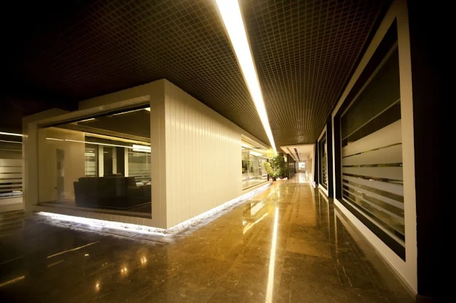
Intensive use, in order to create a comfortable circulation and orientation guide, across the hallway entrance to the linear lighting elements also brought a sense of continuity.
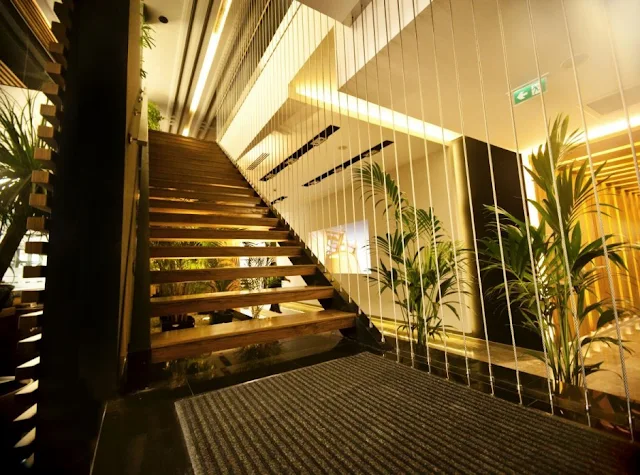
Above the administration floor doubled the welcome section connecting the stairs, paneled wall and hide behind the reception desk and security has been a kind of separation.
In administration floor, 9 meters long executive assistant desk is connecting to corridors which are dominated by shades of brown in dramatic light way to created in the transition areas.
Video wall and the second standby pass the entrance corridor, the L-shaped corridor wooden panels with hidden lighting, continuation of the middle parts of the garden and the café. Middle the inner garden of employees working in offices in green and see and feel nature is based on the theme of a “Green Office” stands out as a scenario. Inner Garden was opened on the glass of the building through cracks and gaps in the light of day directly to the ceiling grid system, with receiving and distributing all the space. Inside the cafe in the garden, give employees a break, relax, socialize and feel the light of day. In order to support this fiction, the middle area and the indoor plants used in the landscape design supported by a water curtain is designed to reduce the power of all the day stress and noise corridors. Offices are opened to inner garden and use day light in every hour in every day efficiently. In the internal garden offices, work stations, convenience functional sense, meeting facilities, libraries, and storage units made of acrylic and wood, and specifically to the needs of today’s modern offices designed by Studio craft312.Units in offices located in sensitive ecological building materials, longevity and understanding of interior design solutions presented in the foreground. The correct use of light and working conditions to meet the expectations of comfort and functionality, from offices in the light of day, supplemented with task lighting over lighting, and hidden lights.
Finally, whole 6000m2 office spaces are designed for creating a new working ecological environment era and interior design project with a unique way of using day lights, materials and plants.
Approaching the design thinking way coming out with a principle that the design is a completed issue in importance of interiors, connection to enviromental landscape and urban design vision when designing a building. And also the importance to Architecture, users, function, aestetic and details when designing the interiors.
The aim of the continuing design practise is searching for the new materials and production techniques on every project that it has a modern understanding with an unique part in respectful for nature. Craft312 as a design team that is searching for functional and aestetic solutions to users without underestimating the human factors.
by Dave


No comments:
Post a Comment