For Michael McCann, designing and operating hospitality spaces comes as second nature. During a 28-year career straddling 12 countries, the principle of Dreamtime Australia Design has created, opened and operated a staggering 80 restaurants worldwide.
In 1995, McCann stepped out of the operational side of hospitality and into the creative side of dining spaces by opening his own design studio, Dreamtime Australia Design, and has since designed a multitude of award-winning hospitality spaces including The Argyle, Pony, Flying Fish, Whitewater and 360 in Centrepoint Tower.
The latest addition to the company’s impressive hospitality design portfolio is Steel Bar & Grill. Tucked in Sydney’s city centre, it’s the second project with clients, George and Nick Kyprianou, whom McCann and his team worked with designing Pony Dining, set in The Rocks Centre.
“We didn’t need to go through that process of getting rid of good ideas because they were cautious; they basically let us design and build what we wanted,” explains McCann of the collaboration.
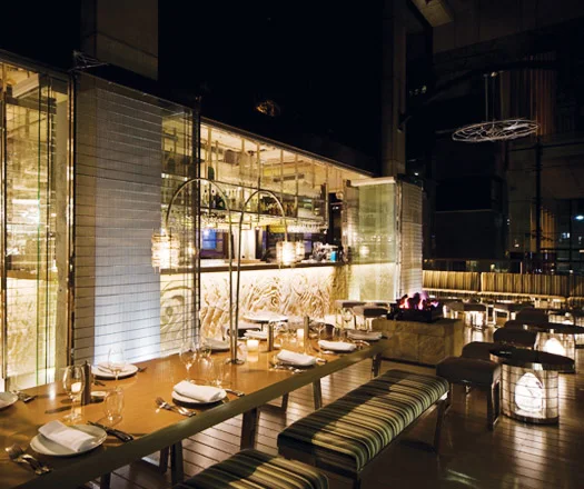
Deviating from the strict design code of timber and brown he is notorious for, McCann was given free reign to design in a new light, creating a space that’s gleaming and bright yet doesn’t forsake his signature knack for producing moody and warm interiors.
Funnily, the design concept first stemmed from a disagreement McCann had with his 10-year-old daughter, Michelena, who bet her father that it was not possible for him to design an entire space without using a single item in the colour brown.
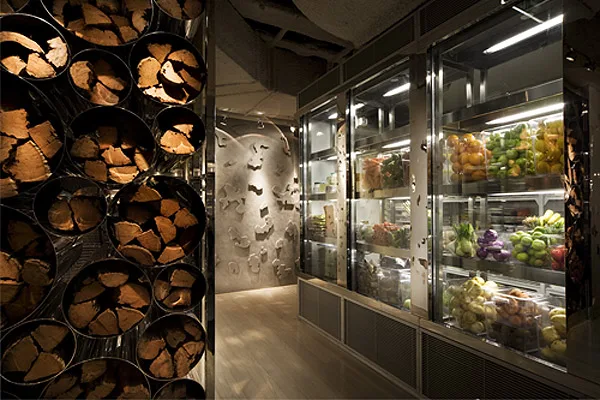
The result is a sultry and dramatic restaurant space, which eschews even a speck of brown and instead offers a shiny palette of polished stainless steel mesh, plate stainless steel, brushed stainless steel mosaic tiles, glass, mirror, waxed polished concrete walls and light silver-grey timber flooring.
“Besides trying to keep it warm and yummy, I tried to keep to a limited palette of materials,” explains McCann of the material decisions, “Whatever the space has going for it, I try to pick a design concept and stick to it and resist the temptation in applying finishes haphazardly,” he adds.
Walking into the space, the connection of materials and a limited palette is instantly evident. In the main entrance is a maze of 2.8 metre polished stainless steel mesh wall partitions with mesh artwork niches that divide the immense internal dining area into cosy mini-spaces.
“I tried to completely avoid the big empty space because it tends to look like a furniture showroom, and when it’s empty – it looks really empty,” he says. The idealism exhibited in the restaurant’s entry is present throughout. Central to the dining areas is an open kitchen, an element that this echoed in many of McCann’s designs, “Most of the restaurants we do, we try to convince the client to keep the kitchen open because it creates theatre,” notes McCann.
by Words Hande Renshaw


